Phonestat

Challenge
Syple's quality assurance software, Phonestat, was being brought back to life after a hiatus. Entering a contemporary market, it required a much needed update to its dated visual identity. The brand needed to reinforce Phonestat's goal of making every call count whilst also combating the stereotype that call center work must be lifeless and monotonous.

Approach
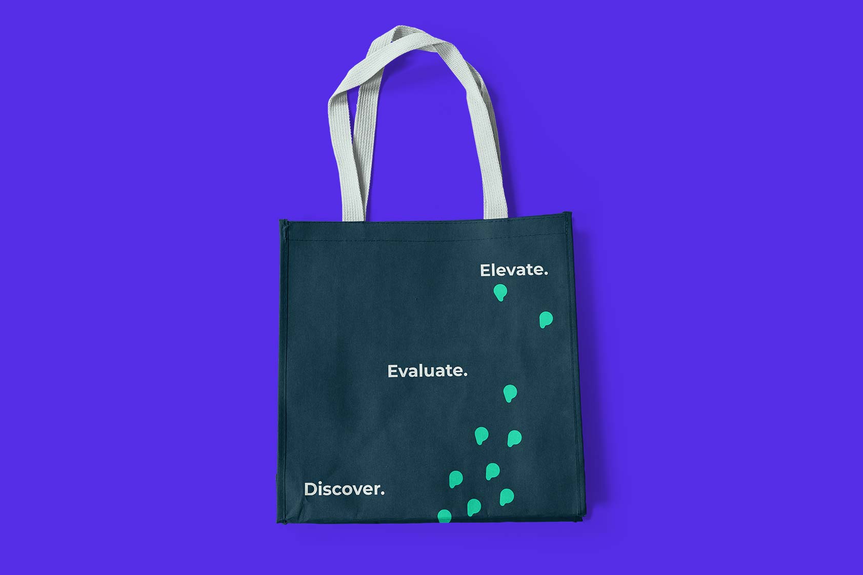
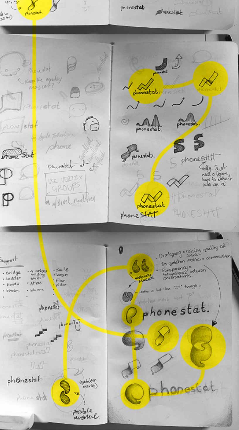
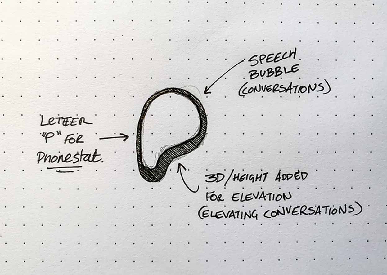
Phonestat’s strength is its ability to elevate the quality of conversations between call centre teams and their customers, and so the motif of growth was scattered throughout the visual identity to support Phonestat’s mission — make every call count. Verdant colours reinforce growth while accompanied by soft undulating shapes to reflect the organic nature of conversations. The playful nature of the new identity aims to defy the rigid imagery of call centres.
Outcome
With a lively new personality, Phonestat was rejuvenated and ready to re-enter the customer communications market with confidence, beginning with Customer Contact Week 2019.